
















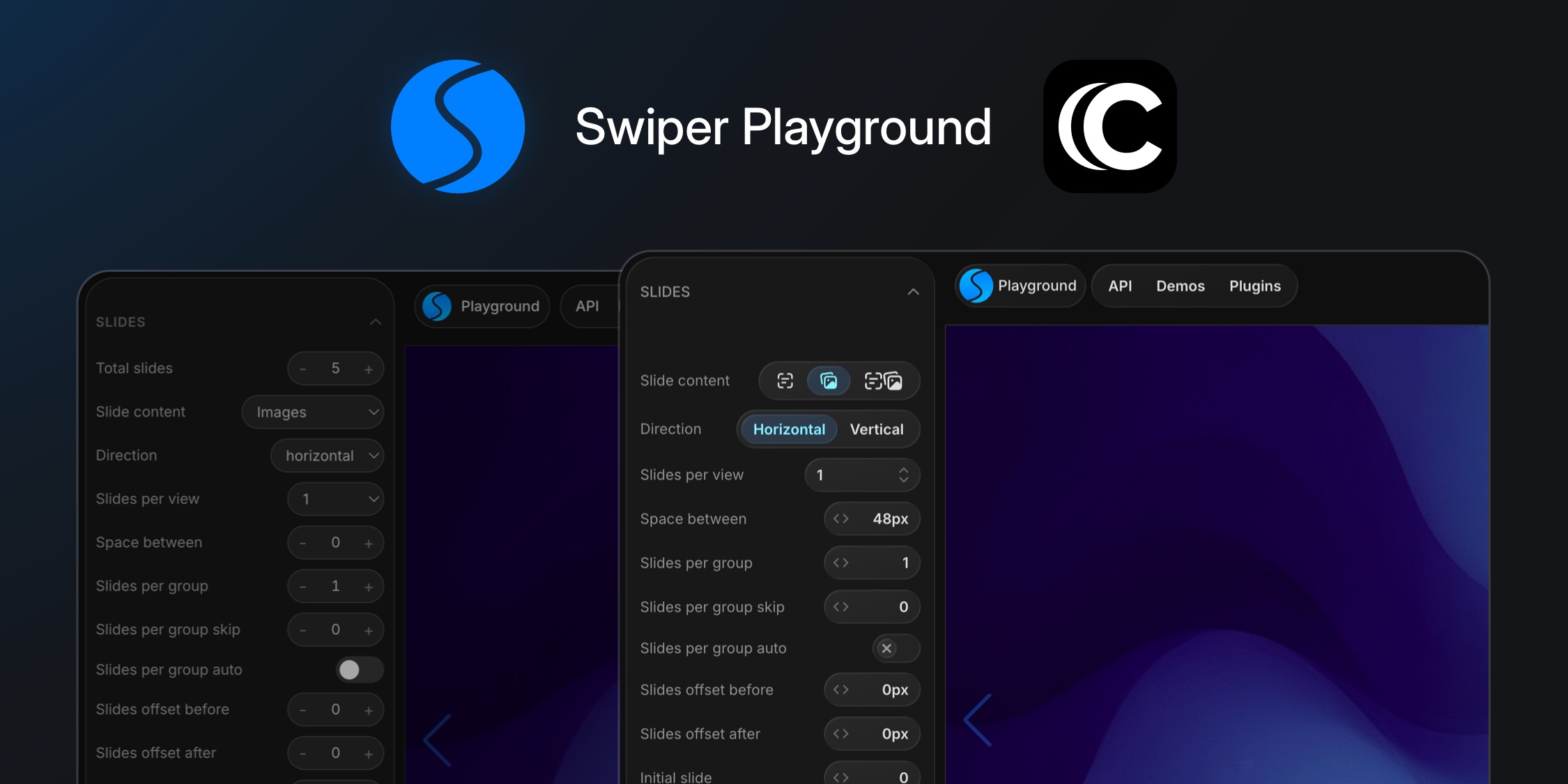
A few weeks back we shipped the Swiper Playground - an interactive parameter explorer that lets you preview any combination of Swiper settings live in the browser. The first version did the job, but the UI was every kind of "good enough" - hand-rolled toggles, hand-rolled steppers, hand-rolled selects, each tuned once and never quite consistent with the next.
This week we rebuilt the whole thing. Same features, denser layout, drag-to-scrub numeric inputs, segmented controls for binary options, real tooltips on icon-only segments. The rewrite took an afternoon.
The reason it was fast: we built it on cladd, our new React UI kit.
What the old playground looked like
The sidebar has roughly 80 parameters. Every row in v1 used one of three hand-rolled controls:
- A boolean toggle - a styled button with an absolutely-positioned animated thumb. ~25 lines.
- A number stepper -
-button, editable inline value with clamp / snap math,+button. ~80 lines. - A select - native
<select>plus a custom popover variant for the effects picker (with PRO upsell rows). ~120 lines.
The shell pieces were the same story. The top action bar was three custom pill rails. The sidebar wrapper was a <div> stack of cladd-tokens-in-disguise - bg-pg-surface-1, border-outline/50, rounded-3xl. The export menu was a bespoke dropdown. Every section header had its own collapse logic.
That's roughly 300 lines of UI plumbing that wasn't really about Swiper.
The swap
Toggle: 25 lines → 1
Before:
<button
  type="button"
  onClick={() => onChange(!value)}
  className={clsx(
    'relative h-[22px] w-[40px] rounded-full transition-colors',
    value ? 'bg-primary' : 'bg-white/15'
  )}
>
  <span
    className={clsx(
      'absolute top-[3px] h-4 w-4 rounded-full bg-white shadow transition-all',
      value ? 'left-[20px]' : 'left-[3px]'
    )}
  />
</button>
After:
<Switch size="sm" checked={value} onChange={onChange} />

Number stepper: drag to scrub
The bigger upgrade here isn't lines saved - it's the gesture. NumberScrubber is cladd's design-tool numeric input. Click the value to type, drag horizontally to scrub it. Hold Shift for finer precision.
<NumberScrubber
  size="md"
  rounded
  value={value}
  onChange={onChange}
  min={min}
  max={max}
  step={step}
  displayValue={(v) => `${v}${unit}`}
/>

The displayValue slot is what makes units land cleanly - 300ms, 0px, 45° show in the field while the underlying value stays numeric. The 80-line -/+ stepper is gone.
Select: pick the right shape per param
For most enum params, the swap is mechanical:
<Select
  rounded
  keyboardHints={false}
  options={options}
  value={value}
  onChange={onChange}
/>

But for binary and ternary params (Direction, Loop, Grid Fill, Slide Content), a dropdown is the wrong shape. Two clicks to choose between off and loop is one click too many. We swapped those to Segmented:
<Toolbar size="sm">
  <Segmented>
    {options.map((o) => (
      <SegmentedButton
        key={o.value}
        active={o.value === value}
        onClick={() => onChange(o.value)}
      >
        {o.label}
      </SegmentedButton>
    ))}
  </Segmented>
</Toolbar>

For Slide Content (Text / Images / Text + Images) we went a step further - icon segments with Tooltip for the label:
<Tooltip tooltip={option.label}>
  <SegmentedButton active={option.value === value} onClick={...}>
    {renderIcon(option.iconKey)}
  </SegmentedButton>
</Tooltip>

Three icons, three tooltips, six lines including the wrappers.
Shell
The frame got the same treatment:
- Sidebar
<div className="bg-pg-surface-1 rounded-3xl border ...">→<Surface outline className="rounded-3xl"> - Top action rails → three
<Toolbar size="md">blocks with<ToolbarButton>children - Export dropdown →
<PopoverRoot><Popover>withSectionTitle,Chip, andButtoninside
The effects picker - with its PRO upsell rows linking out to Swiper Studio - stayed as a custom PopoverRoot + List + ListButton as="a" combo. cladd's Select doesn't render anchor options natively, but the pieces compose cleanly enough that ~30 lines covered it.
The wins that aren't in the diff
A few things that mattered more than the line count.
Sizing is a contract. Every cladd primitive understands the same 2xs → 2xl scale. We pick md once for the row and the Switch, NumberScrubber, Select, and Segmented all land at compatible heights. No more eyeballing 22 px vs 24 px vs 28 px.
Surface depth nests for free. The sidebar is a level-1 Surface. Popovers above it auto-bump to level 2. Chips inside the popover go to level 3. We never set a surfaceLevel prop by hand.
Tooltip is just tooltip="...". Wrap any element, pass a string, done. No portal wiring, no positioning, no setup.
NumberScrubber is the unlock for inspector UIs. Once you have a real drag-to-scrub input, the question stops being "what should the step be" and becomes "do I even need the +/- buttons" - you don't.
One snag worth mentioning
Dragging a NumberScrubber while the pointer crossed the iframe preview broke the gesture - the iframe is a separate document and ate the pointer events.
Fix: dispatch a window event from onPointerDown, listen on the page, flip the iframe to pointer-events: none until the next pointerup:
<NumberScrubber
  ...
  onPointerDown={() =>
    window.dispatchEvent(new Event('playground:scrub-start'))
  }
/>
useEffect(() => {
  const onScrubStart = () => {
    iframeRef.current.style.pointerEvents = 'none';
    const onEnd = () => {
      iframeRef.current.style.pointerEvents = '';
      window.removeEventListener('pointerup', onEnd);
      window.removeEventListener('pointercancel', onEnd);
    };
    window.addEventListener('pointerup', onEnd);
    window.addEventListener('pointercancel', onEnd);
  };
  window.addEventListener('playground:scrub-start', onScrubStart);
  return () =>
    window.removeEventListener('playground:scrub-start', onScrubStart);
}, []);
Fifteen lines, no library needed.
What is cladd?
cladd is an opinionated React UI kit (@cladd-ui/react) built for real apps, editors, and dashboards - not landing pages, not headless primitives. Dark-first by default, surface-based depth model, eleven accent tokens, a unified 2xs → 2xl size scale that everything obeys.
It ships the primitives that actually appear in product UIs - Surface, Toolbar, List, Select, NumberScrubber, Segmented, Popover, Tooltip, Switch, Chip, and more. The kit is what you reach for when "I'll just style a div" is the wrong instinct.
It's new (v0.8.1 as of this post) and still moving fast. If you build dense React UIs - playgrounds, design tools, dashboards, inspectors - it's worth a look.
Try it
- The rebuilt playground: swiperjs.com/playground
- cladd:
npm install @cladd-ui/react- docs at cladd.io
And as always, if you love Swiper, please support the project:
- Sponsor Swiper - get your logo and link featured on the website
- GitHub Sponsors - support the developer directly
And check out our other premium projects:
Your support means a lot for us!